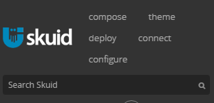
Does the navigation bar have a more scalable friendly mode I’m missing? I copied the Skuid navbar but when you start shrinking the page, the items randomly stack on each other.


Skuid navbar when page is shrunk:

vs what most modern websites do where it has the three horizontal bars and your navbar is more mobile friendly:

Addressing this is one our biggest priorities.  However, we are concerned that merely colapsing to the hamburger navigation icon is too drastic.  Do you think your users would need some intermediate nav structure?  We’ve thought that if icons were defined for nav items, and size was constrained - the text could be abandoned and just the icons would show.  Other ideas? 


Craig, we’re aware that Navigation does not “respond” well at present when shrunk to a smaller screen size, we’re working on improvements to this.


I’ve also had this issue which has prevented me from fully using the custom headers so far. I like the idea of showing the icons as an intermediate structure, and then the hamburger nav icon. 


I could see icons working, however I feel like people are used to seeing the hamburger navigation now days and it wouldn’t be difficult for them to adjust. Personally I wasn’t planning on using icons on my navbar so I would prefer it to be option to only show icons when minimized. 

My current app-wide navbar was built on bootstrap and does hamburger at a certain pixel width. I like how that looks, especially on smaller screens. Haven’t had a complaint from a user on it either. Switching it over to a banzai master-page built one so I can take advantage of global search. I’m sure you guys will come up with a solution that knocks it out of the park. Just wanted to check if there was something I’m missing. 


Hey Team Skuid … any update on this one? +1 for the hamburger approach for me if possible.

Glenn.


No update,  except that we know it needs to be done.   (Frown) 


FWIW, we are not planning on using icons on our nav so would prefer the hamburger approach as well, maybe optional words to show “More” or “Menu” something.  We are using Skuid for our community - only two navs deep so far, so we are looking forward to seeing this come in a future release.  :)


This has been implemented in Brooklyn! So cool.