
Hello All!
I have a bit of a tricky issue to tackle here. Right now I am using a line chart to show how many accounts have been assigned to a certain account manager in their first 90 days. The graph shows cumulative accounts with each line representing a manager. The issue with this current display is the various starting dates of the managers thus showing staggered lines. In order to clean up the graph and create a standard measure I would like to create a graph that shows Number of Accounts Assigned vs Days from Start Date. By taking the difference between the assignment date and their start date I would then have a standardized data set that can show managers progress neatly laid over each other. Please see my current chart for reference.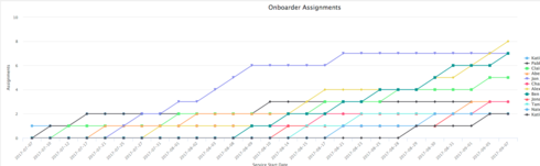
I attempted to use an UI-Only formula field but only got 0’s. Not sure exactly how or if I can utilize UI-fields to accomplish this, thus I am now appealing to the infinite wisdom of the skuid community. If anyone has an idea of how this may be accomplished please share!
Thank you.