I’ve built my first aggregate model to deal with charting tons of records. I have a custom object that has commission payments by month, so my model is just a sum of payments grouped by Date and Sales Agent. It doesn’t seem like the chart understands that the X axis is a date field type, and when I change the function to a Calendar Month or Fiscal month I only get 1, 2, 3… as labels and none of my users will know what that means. On a regular model, they see ‘Jan 2015’ and we can do the additional date Granularities which is great. Any way to adjust this formatting? 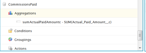
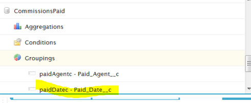
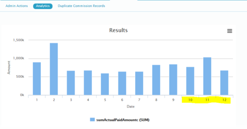
This is an area we know needs to be improved. We have run into exactly the same problem. Here is the workaround we have implemented.
- Use XML to add a second Grouping on the Paid_Date__c. You have to go to the XML to do this. Sorry. Find the PaidDate by Calendar Month line, copy it and change the second one to PaidDate by Calendar Year. Here is xml from a page we have in our org.

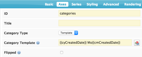
- Use a template to define your axis. This is what I’ve done.
This produces a somewhat better chart.
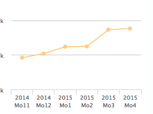
I understand that this is not optimal. Improving this is on our to do list… You can use a before render snippet to replace the X Axis categories, and use the skuid utilitiy “skuid.time.monthNameshvalue]” to replace the number with a name. (See more here) but that’s more than I can get to today…
Thanks, this will be just fine! Except my dates are not ordered in the chart. Can you help me get that straight?
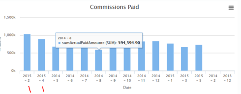
I found a thread with how to order using dates on an aggregate model and got this working. Thanks!
Great!
I seem to be running into the same issue. This post is from 2 years ago, is this something that has been addressed in a recent version of Skuid or will I have to follow the instructions above?
Three years later - here is another set of ideas for getting the Month name into Charts built on aggregate models.
Add a UI only formula field to the aggregate model. (in the Aggregations section of the model configuration).
Two ideas:
- Use the “MonthNameShort” function to derive the month name out of a constructed date that uses the month number you got as your grouping. Something like this:
MONTH_NAME_Short({{monthNumberGroupingAlias}}+“/01/2000")
- Build a big case statement that translates the month number in to a Word. .
Then use the UI Only field as your Category Axis in the chart definition.
Enter your E-mail address. We'll send you an e-mail with instructions to reset your password.

