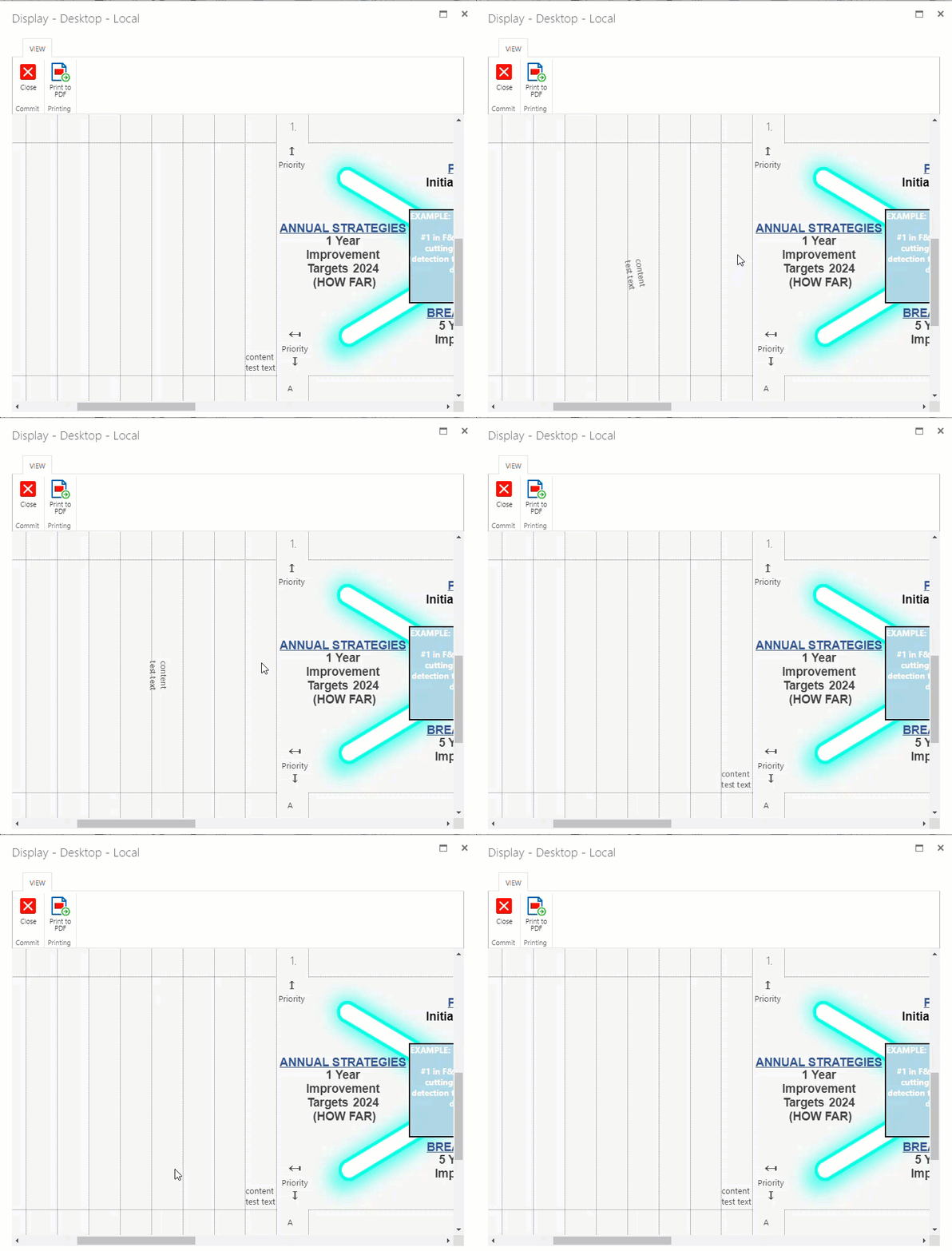
Since a while I noticed that the vertical alignment via CSS styling is no longer applied properly.
The inner control works well (like in edit mode) but displaying the content of e.g. a dropdown box or multiline text field, is no longer writing vertically.
Also it looks like the length (size) of the controls is not properly set by CSS.
I am using this style:
.bb-input-vertical-up
{position: absolute;
.nf-filler-control select { height: 100%; width: 100%; }
display: inline;
transition: width 2s, height 2s, background-color 2s, rotate 2s;
-webkit-transform: rotate(270deg);
-moz-transform: rotate(270deg);
-o-transform: rotate(270deg);
transform: rotate(-90deg); z-index: 1;
writing-mode: vertical-lr;
text-align: left;
}
.bb-input-vertical-up:hover{ position: absolute; rotate: 90deg; z-index: 999 !important;}
The code will align the assigned controls, vertically and rotate it -90 degrees (horizontal) again when hovering.
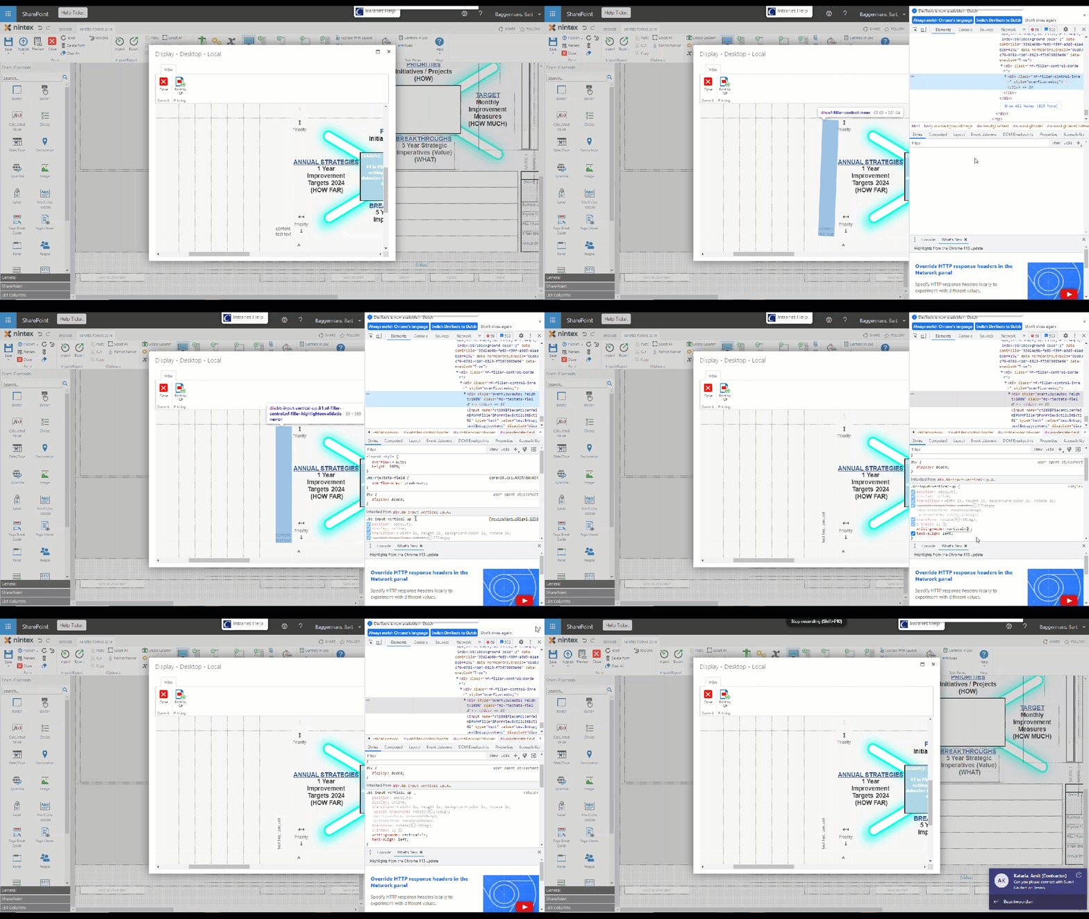
When I inspect the control in Display mode then the content is using:
    font-family: "Segoe UI", Segoe, Tahoma, Helvetica, Arial, sans-serif;
    color: rgb(68, 68, 68);
    font-size: 10pt;
    visibility: visible;
    border-collapse: collapse;
    writing-mode: vertical-lr;
    text-align: left;
    overflow-wrap: break-word;
    overflow: auto;
    height: 100%;
There is a line saying “writing-mode” which should do the job I assumed.
Now the strange thing is that when I adjust that line (like remove lr -r then is suddenly pops vertical.
Anyone an idea why this happened so suddenly?
Maybe CSS is not declaring everything or not properly. Am I missing things or are there lines modyfied recently?


