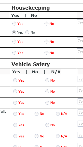
I have a scenario where user is using radio buttons in a list / grid view and some of the answers have 2 and some of them have 3. I'm finding it extremely difficult to align the answers. SEE IMAGE
Would like - consistent
Yes | No
Yes | No | NA
Yes | No
Yes | No
Yes | No | NA
How it looks
Yes | No
Yes | No | NA
Yes | No
Yes | No
Yes | No | NA
Is there an easy way to align these?? I've tried setting width and such but upon different screen sizes and / or PDF Generation the longer answer ones disappear.
I would prefer not having to split these into individual radio buttons in different columns. This is a form with save as draft options and attempting to program that in for each set of answers would be tedious and they are trying to stay as OOTB / No code / No configuration as possible.


