Question

For changing the styles through CSS

  • 12 February 2024
  • 3 replies
  • 105 views

Userlevel 2
Badge +4

I want to change the style of the drop down list but was not able to may be i am missing something please any1 help me with this.

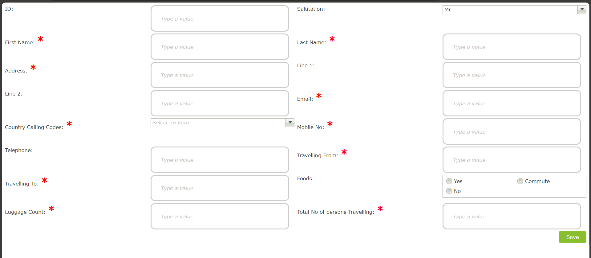
As you can see drop down list is not reflecting any changes for your refrence I am pasting the two css codes here so that you have a clear picture of it.

Red Mark CSS code- <style>.theme-entry span.SourceCode-Forms-Controls-Web-Label[name$="_required"]::after { color: red; content: "*"; font-size: 1.4rem; font-weight: 700; margin-left: 4px;}</style>

Text Box CSS Code - <style>.theme-entry input.SFC.SourceCode-Forms-Controls-Web-TextBox { width: 300px; /* Adjust width as needed */ padding: 20px; /* Adjust padding as needed */ border: 2px solid #ccc; /* Border color and width */ border-radius: 10px; /* Curvature of corners */}</style>

In the same way it should work for Drop down also but its not working please help me


3 replies

Userlevel 6
Badge +22

Hi @Sneh bharti,

Please see the Nintex Help files for the correct way to add CSS code.

Userlevel 2
Badge +4

Hi @Sneh bharti 

I see you have the Nintex K2 5 tag in your question, but it is in NAC (Nintex Automation Cloud), witch is a different product.  Please see if you can recategorize it.

I will answer from a K2 5 perspective in the mean time.

The Dropdown list is a much more complex control (from a raw HTML and CSS perspective) so the selectors you used for your second CSS injection will not work.

I started by setting the width, border and padding using the K2 designer instead of an injection.  placing it in the injection had undesirable effect. (The image that makes up the right hand side of the control does not scale.)

Set the width and click formatting to set the padding.


Set the border
Set the padding
Rounding the corners is disabled
​​​​

We have 2 html elements to modify for the control corners. I have identified the below selectors

.theme-entry .input-control.select-box .input-control-buttons,{
border-bottom-right-radius: 10px;
border-top-right-radius: 10px;
}
.theme-entry .input-control.select-box .input-control-m-c {
border-bottom-left-radius: 10px;
border-top-left-radius: 10px;
}

PS, you might want to consider custom stylesheets

https://help.nintex.com/en-US/nintexautomation/devref/5.7/Content/Themes/Custom-Themes.htm

Regards

Userlevel 5
Badge +20

Hi @Sneh bharti 
Is your question answered? 

Reply