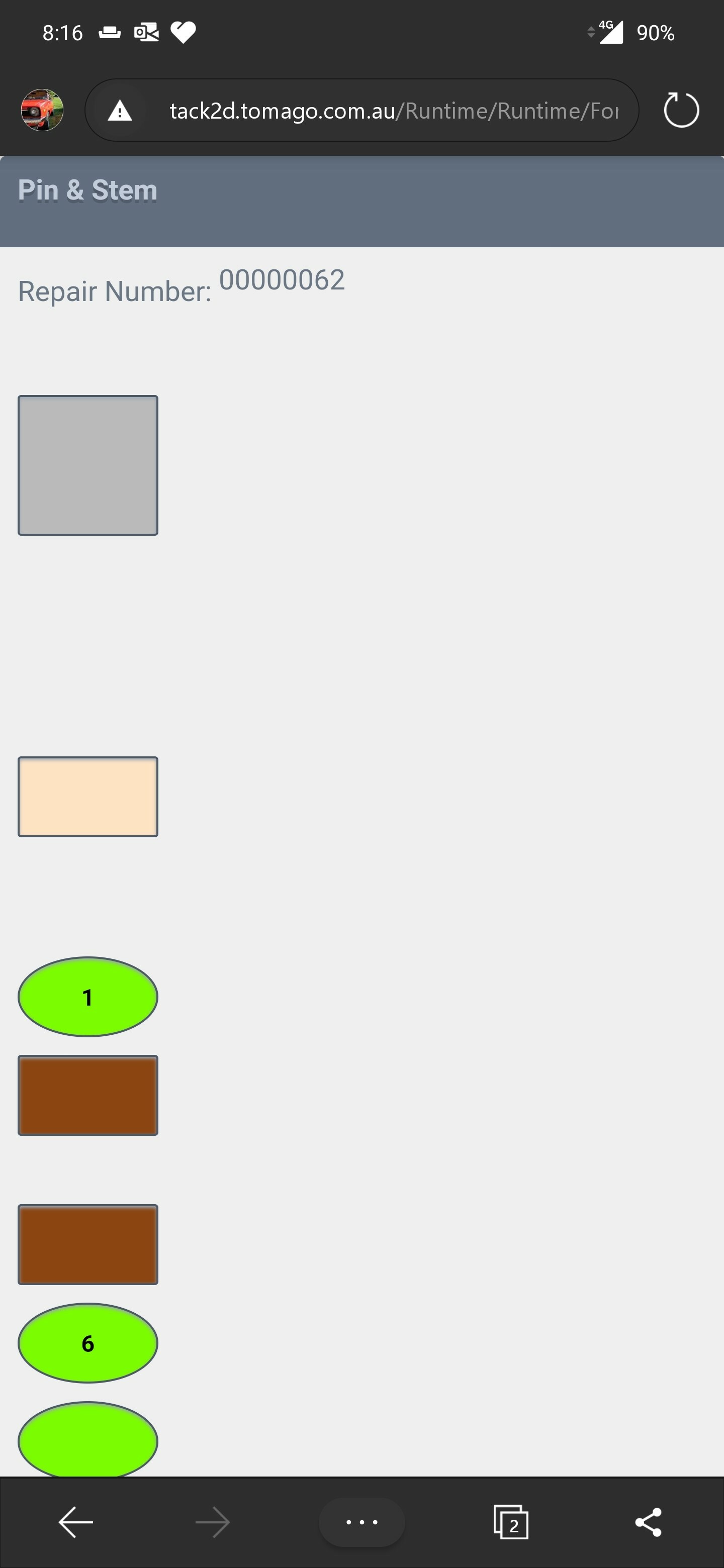
We have several forms that are used on mobile with no problems.
i am creating a new one which has custom buttons .
On the phone accessing the View looks correct
any ideas on why this happens, and what we can do to make it look correct?
Cheers
We have several forms that are used on mobile with no problems.
i am creating a new one which has custom buttons .
On the phone accessing the View looks correct
any ideas on why this happens, and what we can do to make it look correct?
Cheers
Good day braddo
I would suggest that you use lithium theme if it’s there in your K2 version, and in case you were not using it. Building SmartForms for Mobile Devices: https://help.k2.com/onlinehelp/k2five/userguide/5.3/default.htm#Create/Forms-Mobile-Apps.htm. Look at the following as well:
Custom Themes: https://help.k2.com/onlinehelp/K2smartforms/DevRef/4.7/default.htm#Custom_Themes.htm%3FTocPath%3DCustom%2520Themes%2520%7C_____0,
Creating a Custom Theme: https://community.k2.com/t5/K2-Blackpearl-Forum-Posts/K2-Form-UI-Design/td-p/83300/page/2,
Known Issues List and workarounds: https://help.k2.com/kb001573.
Best,
Sunrise
Hi
K2 forms are web responive only on Lithium theme and thus if you have your own custom theme, make sure it is built on top of lithium theme. There are certain points should be consider or to look at when you building your form to be used on both dektop and on mobile browsers.
To make it work, i always build a seperate form to be used on mobile browsers, and on the main form, at the form initilization, i set a condition to check the browser width, if its less than 500px, then i render the mobile form which is designed with the above consideration facts, else i render the main form. This is one of making forms to render on different browsers widths. i'm happy to hear suggestions fom others as well
Also have a look at this section:
Changing screen settings for display on a mobile device
https://help.k2.com/onlinehelp/k2smartforms/userguide/4.7/default.htm#Using_Mobile_Devices.html
K2 Smart Form in mobile application is not responsive.
Last but not least, check out:
Forms Considerations and Best Practices.
Use this article for more information about considerations and best practices when designing mobile forms.
All the best.
we are using Lithium already
the current form i am working on has 5 columns. i can look to reduce this
i guess i will need to use data labels between controls to pad out the spacing i need
Hello
I am glad
@braddo wrote: we are using Lithium already
the current form i am working on has 5 columns. i can look to reduce this
i guess i will need to use data labels between controls to pad out the spacing i need
Now for a little more:-
The Lithium theme is a responsive theme which you can use on touch interfaces such as tablets or smartphones as well as desktop browsers. The theme adapts to smaller screen sizes by resizing and moving elements for optimal viewing.
You need to consider the following when you design forms for smaller devices like smartphones and tablets:
Ensure that labels and their controls are either on the same row or in the same cell. The smaller screen causes controls to move below each other, and empty cells create big spaces between controls and labels meant to show above or next to controls.
Ensure that you use the correct Max. Form Width for subviews and subforms. Popups that open in portrait layout do not update when you change the orientation in runtime and they only adapt for orientation when you reopen them.
The form width on a mobile device is 100%. To adjust the width of the form, change the Max. Form Width property
Browser Compatability:
All the best.
Enter your E-mail address. We'll send you an e-mail with instructions to reset your password.