Hello All,


We have few forms that are going to be opened on both, desktops and mobile. The mobile apps will have the tasks and users can select which tasks to open, forms will load and actions will be recorded.


My question is is there a way  to accomplish the following?


1- when a user gets an email for a task, can we send 2 links, one for desktop that would open the form in the browser and one for mobile that would open the K2 mobile app?

2- if the app opens the form, is there a way to hide few controls/views that would look hideous on mobile (IE list view with lots of columns)


I have looked and found that there is a folder called Application Forms under system in the designer, is this where the forms for the applications are stored?


if so, how do you set a workflow user task to use 2 forms,  to use both the one here under this folder and the one for the desktop? ( when you run a smart form task, you have to select a single form with a single state)


I know this is a long shot, but it's worth asking. any pointers or info are welcome!


Thanks!

I haven't done this in K2 but you'd be looking at CSS media queries. They do exactly what you're asking, they give you the ability to hide or show controls based on the screen width, resolution, device type (print or screen).


Lithium is the only responsive theme, so you'd need to modify it's CSS. Have a look and you'll see @media entries and the screen size (breakpoint) that it targets.


In standard web development to hide a drop down combo box on a device that is at max 500px wide, you'd do something like this.


<body>

<select class='mobileOff'>
<option value="volvo">Volvo</option>
<option value="saab">Saab</option>
<option value="opel">Opel</option>
<option value="audi">Audi</option>
</select>
</body>


In CSS 


@media only screen and (max-width: 500px) {

.mobileOff {display:none}

}


Hi Zack,


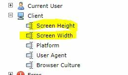
Instead of maintaining form for desktop and mobile, you can create a form with applicable for both Desktop and Mobile by setting control width based on form factor of "System Value - Screen width"


1. Create a smartobject (stored procedure) with input Screen Width and the ouput are  LabelWidth and ControlWidth.  

     LabelWidth is the fixed width for Label 

     ControlWidth is the fixed width for Control (Textbox,DataLabel,Dropdown,etc)

    Example   Submission Date     :    01/01/2020

                       Submission Date ->  Label

                       01/01/2020         ->  DataLabel


      You call this smartobject in INITALIZE and store the output in HIDDEN Datalabel.

      You need to create UNBOUND RULE,  to set properties width for Label and Control


       The logic for managing Label width and Control width should be in smartobject (storedprocedure)  to easy maintain.     

       Example Stored procedure :

       INPUT   : @SCREENWDITH INT


       DECLARE @LBLWIDTH INTEGER=150
       DECLARE @CTLWIDTH INTEGER=350
   
       IF(@SCREENWIDTH >= 1366 )   -- IPAD PRO LANDSCAPE
       BEGIN
           SET @LBLWIDTH=150
           SET @CTLWIDTH=170
      END
   
       ELSE IF(@SCREENWIDTH >= 1024 )  -- -- IPAD LANDSCAPE / IPAD PRO POTRAIT
       BEGIN
           SET @LBLWIDTH=150
           SET @CTLWIDTH=170
        END
 
       ELSE IF(@SCREENWIDTH >= 823 ) -- PIXEL 2XL 5S LANDSCAPE
       BEGIN
               SET @LBLWIDTH=150
               SET @@CTLWIDTH=22
        END
 
       SELECT @LBLWIDTH AS LABEL_WIDTH, @CTLWIDTH AS CONTROL_WIDTH


       Screen form factor you can check on chrome (F12) ,

        Example Iphone X  (375px potrait or 812px landscape)


2. On View Design Layout, you need to have a TABLE ( 1 colum, multiple rows)

    For every Label and Control, you need to set Margin Left and Margin Right : 5px  (to give same space), WrapText : True


    As default usually I set Label: 150px, Control 150px,  during runtime I change dinamically for Control width based on return value from the smartobject. 


     Example Layout on view (4 column):

       Row 1       Label1_ _ _ _  Control1                  Label2_ _ _ _  Control2                                   

       Row 2       Label3_ _ _ _  Control3                  Label4_ _ _ _  Control4                  

       Row 3       Label5_ _ _ _  Control5                  Label6_ _ _ _  Control6                  


       When the width of Label & Control overflow the browser width, It will auto adjust as follow


       Row 1       Label1_ _ _ _  Control1                 

                         Label2_ _ _ _  Control2                  

       Row 2       Label3_ _ _ _  Control3                  

                         Label4_ _ _ _  Control4                  

       Row 3       Label5_ _ _ _  Control5                  

                         Label6_ _ _ _  Control6                  


      You can experiment for layout   6 colum or 8 column


Reply