I have a calculated field at the top of my form that does a lookup on a list to display a message on how to use the form.   I set Resize at runtime for the control.   It indeed resizes the control but all the forms under it stay in place and the text sort of overlays the rest of the form.   This makes the feature pretty much worthless.

Is there any way to resize / shift the rest of the form so the calculated field does not overlay the rest of the form?

P.S.   I plan to place similar calculated fields at various places on the form.

I placed the calculated field inside a panel.  Had resize at runtime turned on the the panel.   The panel did not resize, instead scroll bars were displayed.  Not an ideal situation.  Why isn't the panel resizing?


make sure that no controls on the form overlaps. it may cause problems as you experience.

have a look on developer console as well whether there are not reported any errors.


Yes I know that thank you.   Nothing us overlapping.    There are no errors in the console.


Here is an example of the design.   As you can see, nothing is overlapped.  The calculated field is a lookup to a list.    Resize at runtime is turned on for the field.   The field resizes at runtime but it overlaps Title depending on the amount of content in the lookup.


try to place title and a control next to it to a panel


Next to it?    Not sure what you mean.  If front of it?   behind it? 


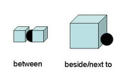
"next to" wink.png

source: https://www.espressoenglish.net/prepositions-of-place-in-english/

Difference between beside next to

put a panel on the form.

catch two marked controls by mouse and move them into the panel.


Reply