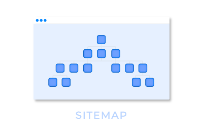
I have a UI as below design. There are some component on different panel. Panel B and C will either display one and I use rule to control the panel or panel's component to hide or disable.

Design

201942_pastedImage_2.png

When I create the form, Panel C is hided. But I don't know why Panel E will overlap with Panel B and D. I expect Panel E will be rendered below Panel B and D.

Stage 1

201943_pastedImage_3.png

The most strange thing happen. When I submitted the form and the status change. Panel B will hide and Panel C will appear. It show what I expected.

Stage 2

201944_pastedImage_4.png

The Panel C contains 3 more panels and set rule to control the hide behavior. Will this affect the panel E at stage 1? I have checked the html for panel C is display: none; But Panel E div style are different at Stage 1 and Stage 2.

I would like to know how to solve this problem? 

I have solve the overlap issue but another issue is occurred. I would like to know what's that best way to create the above layout?

I have changed the layout as below: It display fine in Stage 1.

201947_pastedImage_1.png

There is a large empty gap before panel E in Stage 2. 

201948_pastedImage_2.png


Since Hide rule will include CSS display:none on the panel, the controls surrounding it requires enough spacing. So proper spacing of panel should resolve this issue. 

Try these steps:

  1. Use the Developer Tool (F12) of the browser and find the CSS that affect the spacing
  2. Try to update the CSS to fix the issue in the browser
  3. Apply the same on the form by providing more spacing between the panel/controls
  4. Preview to test

in the original layout where panels B and C overlaps each other, I would try to put panels B,C and D into one another panel.

in the second layout where panel B is below C one, I would sized panel D only as big as needed (so likely as big as panel C). you will have some empty space in designer, but form should be correctly rendered at runtime.


Hi Marian,

Thanks for your hint. My UI is working now. Also can set resize at runtime to No.


thanks for update.

would you share which option have you finally implemented?


I am having a similar problem.  I'm new to this and struggling, but I've been able to figure out how to create and hide the panels and have them show with a choice control.  However, I have not been able to figure out how to fix the overlap.  Everything I've come across says make sure that panels don't overlap in the form.  They don't overlap.  Says also that it should automatically pull to the top of the screen automatically depending on the choices selected.  I don't write code, so I don't even know what it should say.  

I have 2 problems:


1.  They overlap even though in the form they don't.  And it is from 2 different forms/panels that overlap.  Anyone know how I can fix this? 


Overlap in preview

panel overlap in preview


Don't overlap in forms view

form shows no overlap


2.  I want the comments to appear in-between my submitter information and the card that is selected, so that they make the selections Green, Yellow, Red, N/A first then add comments after.  How can I fix the blank space in-between and have it move with the form panels?


lots of white space on form 

<body><p>I'm new to this and struggling, but I've been able to figure out how to hide the panels and have them show with a choice control.  However, I have not been able to figure out how to fix the overlap.  Everything I've come across says make sure that panels don't overlap in the form.  They don't overlap.  Says also that it should automatically pull to the top of the screen automatically depending on the choices selected.  I have 2 problems:</p><p></p><p>1.  They overlap even though in the form they don't.  And it is from 2 different forms/panels that overlap.  Anyone know how I can fix this? </p><p></p><p>Overlap in preview</p><p><img __jive_ID="207532" alt="panel overlap in preview" class="image-1 jive-image j-img-original" src="https://community.nintex.com/servlet/JiveServlet/downloadImage/105-16861-207532/panel+overlap.PNG" style="width: 620px; height: 189px;"/></p><p></p><p>Don't overlap in forms view</p><p><img __jive_ID="207551" alt="form shows no overlap" class="image-2 jive-image j-img-original" src="https://community.nintex.com/servlet/JiveServlet/downloadImage/105-16861-207551/panel+shows+right+in+form.PNG" style="width: 620px; height: 174px;"/></p><p></p><p>2.  I want the comments to appear in-between my submitter information and the card that is selected, so that they make the selections Green, Yellow, Red, N/A first then add comments after.  How can I fix the blank space in-between and have it move with the form panels?</p><p></p><p></p><p><img __jive_ID="207552" alt="lots of white space on form" class="image-3 jive-image j-img-original" src="https://community.nintex.com/servlet/JiveServlet/downloadImage/105-16861-207552/desc+panel+lots+of+white+space.PNG" style="height: auto;"/> </p></body>

‌, I'd recommend to start brand new question for your issue.


Reply