Hello,
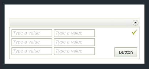
You might consider adding a Data Label to the top of your View or Form, then add some styling to the Text input. Remember to check the box to make the control Literal. Below is an example.
In the Text property of the Data Label control I've added the following (no spaces):
<style>@media screen and (min-width: 800px){body{width:65%;margin:0px auto;}img{height:35px;width:35px;}}@media screen and (max-width: 480px){body{width:100%;}img{height:15px;width:15px;}}</style>
I'm controlling the size of the image and the width of the form.
Wide screen view:
Be aware that you will want to add the styling last because it may also resize your Designer screen (in design time). This is a bit clunky, but may get you started at any rate.
I hope this helps.
I remember there is a vdeo in K2 youtube channel or the K2 Videos not sure and demonstrate this exact case.
Basically on initialize the form/view you use the params to determine what kind of view you will render if will be the mobile or the full view or some other custom view based in the resolution.
Uses and advanced condition to make this pattern matching.
later with that information is used to render only the appropiate view that is labeled for your particular case and have the controls optimized for that.
Try to do some search its been a while since I saw it but surely will solve your issue. There is no need to change the CSS or hack the view.
Dino.
@K2CaveMen,
So, what you are doing then is creating multiple views based on the media query, or the Client Screen Width? You would have a view based on a mobile device, another based on tablet and another based on screen? (Or, in this cae, not device, but screen width.)
The param would determine if the condition is true or not, then render the correct view based on the value? I was trying to approach this by rendering a single view in different widths, rather than creating multiple views.
If you could expand any, that would be great. Also, I searched for the videos and was not able to find one that deals with dynamic rendering based on screen width. I'll keep looking, I'd be interesting in seeing it.
Thanks very much, I've got it to work with the datalabel - you've saved me alot of grief =)
Although I did a transfer data on the form initialise into the literal datalabel to get around K2 Designer resizing.