I found if you change the CSS class of
.nf-filler-control-inner label
and set display: inherit;
that it will put the text alongside the checkbox/radio button. Because it is set to inline-block it forces it to it's own line.
You could just put in your own class instead so that you do not accidentally overwrite other labels.
Andrew,
Works great for the list form.
When I display using the Nintex Form Web Part, text is still misaligned.
Any thoughts?
That's interesting that it would be different. I wonder if the CSS class inheritance is changed when in the web part. Maybe trying to force an inline-block would help and not use inheritiance
I'm using Nintex Forms 2.9.0.0 and can't get this to work. I emailed Nintex support and they said it's because this thread is based on 2.5.
Anybody out there get this working on 2.9? Thanks in advance.
Gary
Then the css classes have changed since. Thanks for the update. But I believe the same effect will work if you can apply an inline-block to the values.
Hey Andrew,
I'm trying to follow your instructions, but the "set display: inherit;" portion is grayed out in my form designer. Is this a setting I should have my admin change so I can edit the display format?

Thanks
Kassie
Never mind, I added the CSS to the form settings and it worked.
thanks
Kassie
We're using Nintex 365, App Version NFO 1.2.3.0. Is there a solution for this question for this app version?
Thanks.
Would that be something I just add to a new line 4 in the Custom CSS form setting?
/* Template styles */
.nf-form-input .nf-filler-control-inner, .nf-form-label .nf-filler-control-inner
{
top: 10px;
bottom: 10px;
left: 10px;
right: 10px;
}
.nf-form-input .nf-textbox-wrapper
{
left: 0px;
right: 0px;
}
/* Label styling for desktop layout */
.nf-form-label
I would add it above all these. That way it's your customization and easily control its reach. Try not to change the default unless you absolutely have to.
Andrew,
First, let me tell you I am brand new to Nintex Forms literally started working with it last week.
I am working on a form with Choice Options which are not aligning with the radio button. I would like the option to align as shown in the green box.

I added the code you posted into the Choice Options Control Setting>Formatting>CSS Class and it still did not align properly. did I not insert it in the correct place?
 .
.
Any assistance you can provide would be greatly appreciated.
Sure William, welcome to the community! The CSS addition should be made in the Form settings, under CSS and not in the control settings. Leave the control settings to have the default class in place, I think it was .nf-form-input.
In the form settings, under CSS, you will see pre-existing setup. you can either change the existing classes or add new ones at the top by copy/paste what posted.
As an alternative to @andrewg's solution (which didn't work for me btw, and I'm using Nintex with SP16 on-prem), you can set the display property of the checkbox's label tag to inline instead of inherit. Also, instead of overriding the Nintex form classes, you can use or add your own class into the mix.
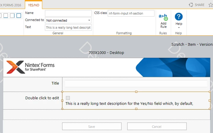
So starting with this default behaviour where long text does not wrap nicely alongside the checkbox:

Add a new class to your Form Settings > Custom CSS:
.myclass label {

    display: inline;

}
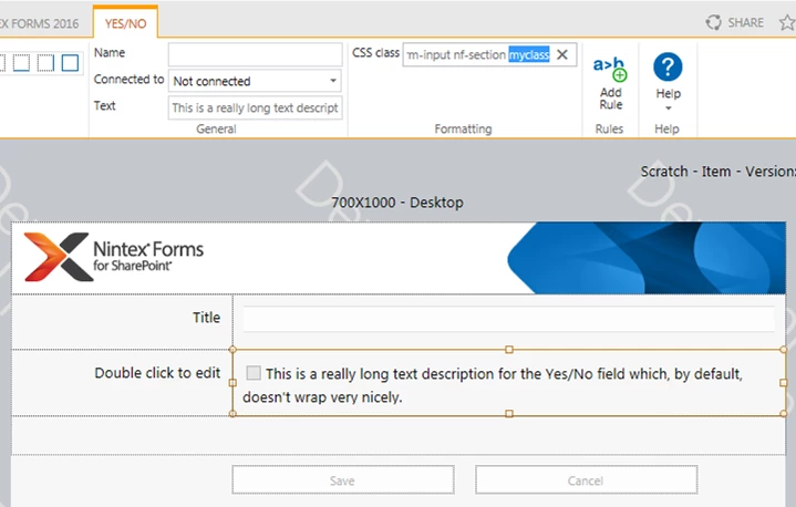
Then specify this new class in your Yes/No control's CSS class attribute. You should now find the text displays alongside the checkbox:

Hope this helps.


 .
.