Any Drawloop user in the Salesforce ecosystem knows that Nintex can deliver powerful document automation using data in Salesforce. This automation typically includes point-to-point value to document merging. However, there is sometimes a need to go beyond what is simply stored within Salesforce and deliver aggregates, grouping or charting of data.
Drawloop does have the ability to preserve native MS Word, Excel and PowerPoint charts within a template. Drawloop can feed raw SFDC data into a template and allow a MS Word, Excel or PowerPoint chart to update and reflect the incoming raw data. This is especially powerful when making use of pivot charts or tables.
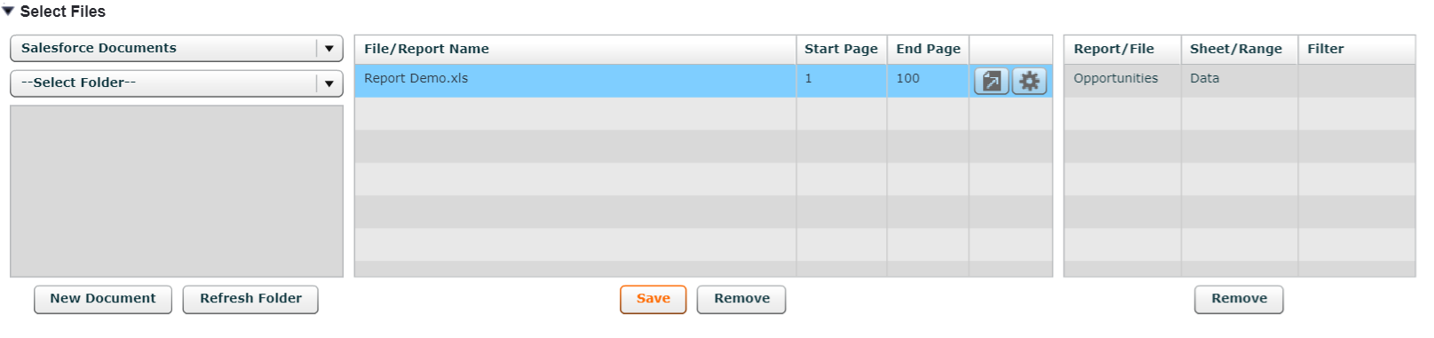
To make this work, you must first push the raw data to your template. In our example, the template is in excel. The raw SFDC report data is going to be pushed to the ‘Data’ sheet and our pivot chart will be on the ‘Output’ sheet.
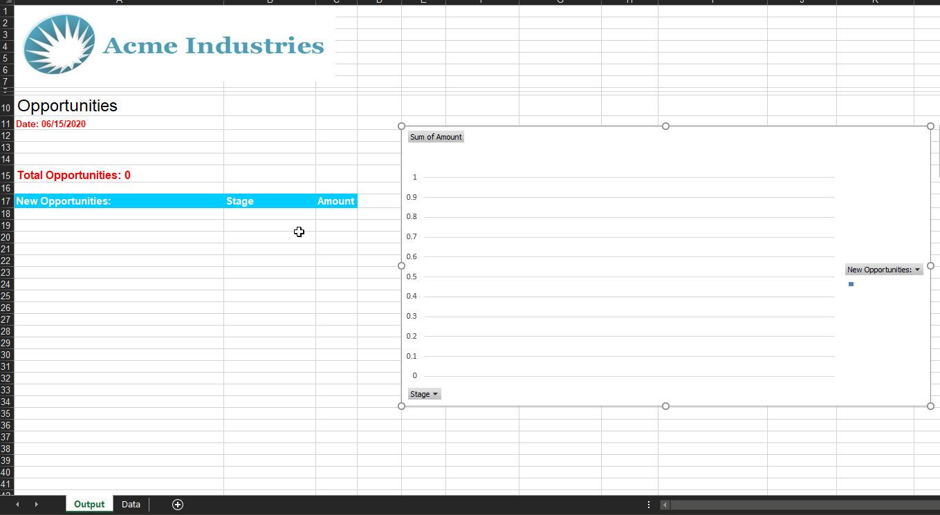
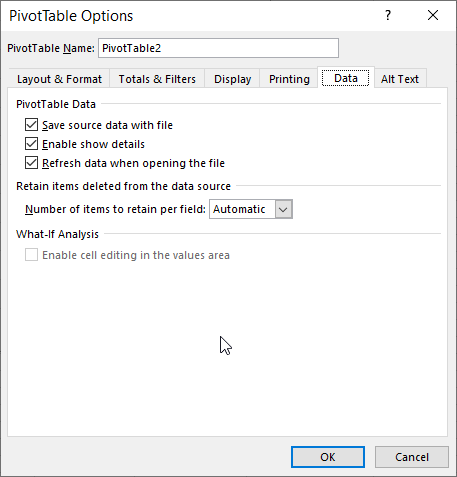
Within the template, you’ll need to insert a pivot chart of your choice and highlight what you want to use as the data source. The data source can be the raw incoming SFDC data or formulaic references to this data. The most critical step to this entire process is navigating to the ‘Data’ tab within the ‘PivotChart Options’ and checking the box to ‘Refresh Data when Opening File’. This option will ensure that the pivot chart is updated after the SFDC data has been merged into the template.
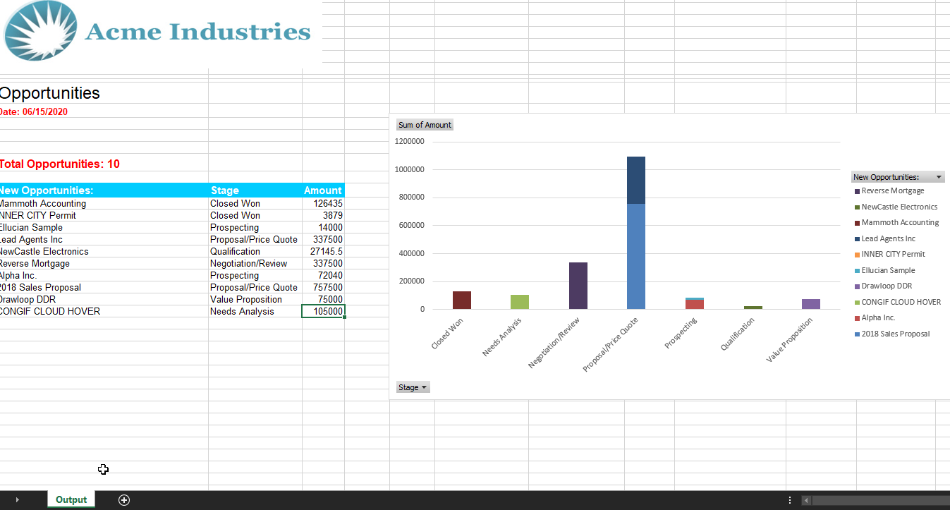
And now with everything setup correctly, you can run your Drawloop packages and receive branded and professional looking reports with relevant charts.