I am new to SharePoint and Nintex and, whilst the others here have generally been using the classic forms, I thought that for my first project I would try out the responsive forms. I have encountered a few problems on the way, but have managed to resolve most of them. However, there is one issue that remains for which I cannot figure out a fix.
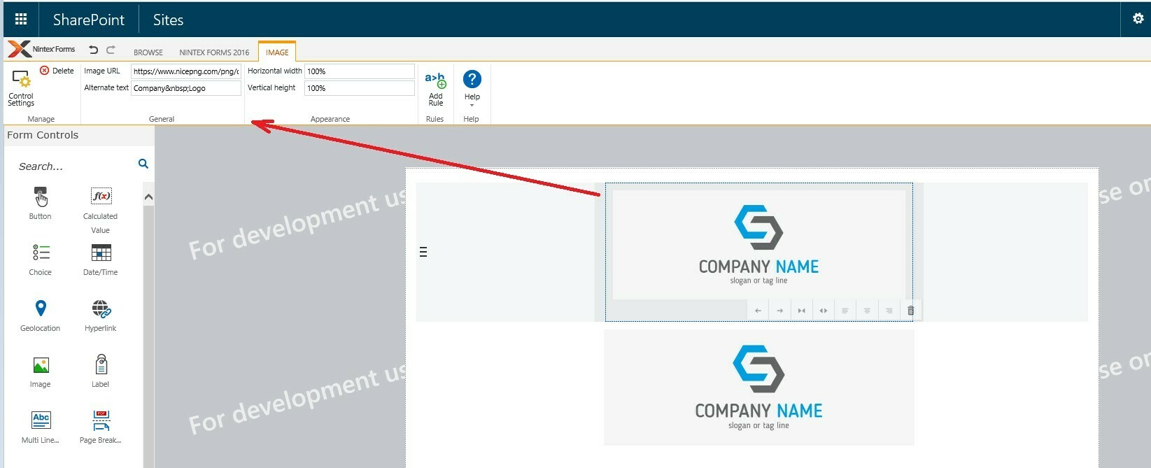
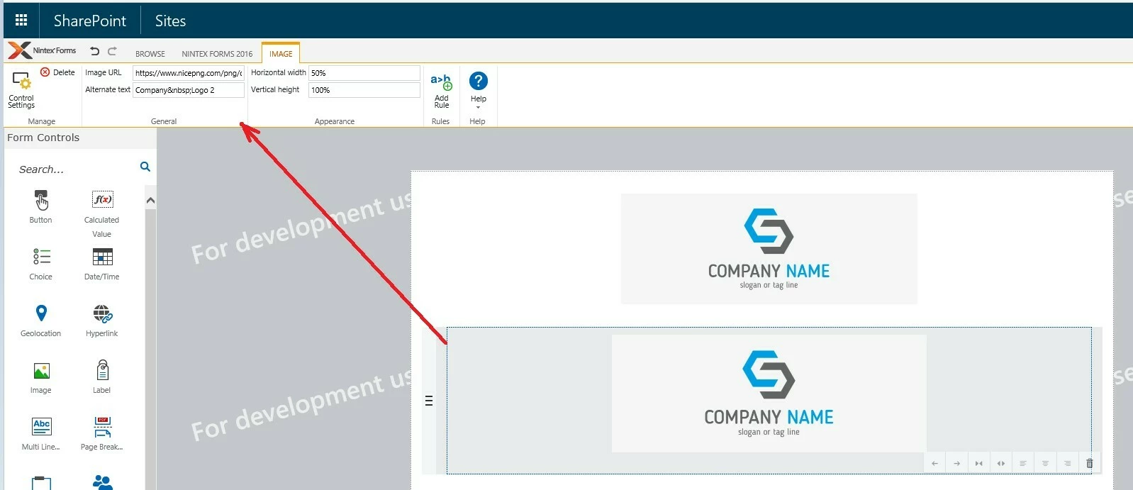
So at the top of the form I have placed an image control with our company logo. I have tried this with two different layouts…
- I set it to 2 columns wide and moved it right by 1 so as to centre it.
- I set it to full width (4 columns) and centred the image.
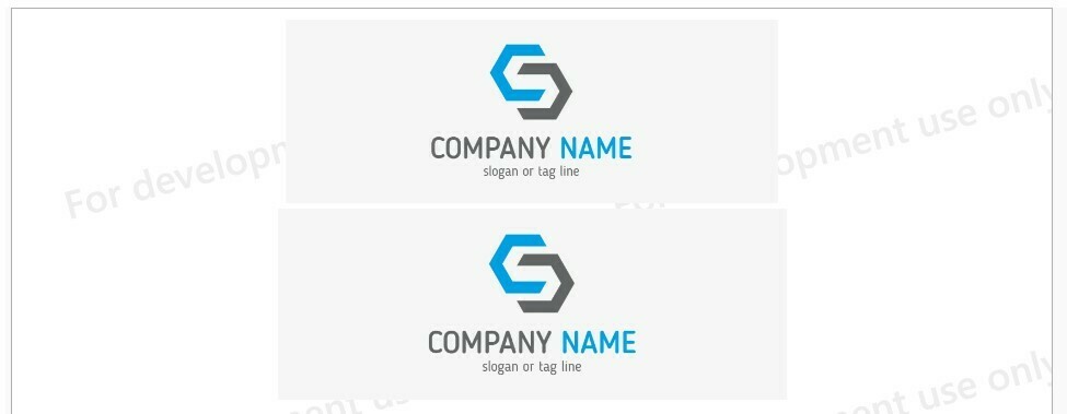
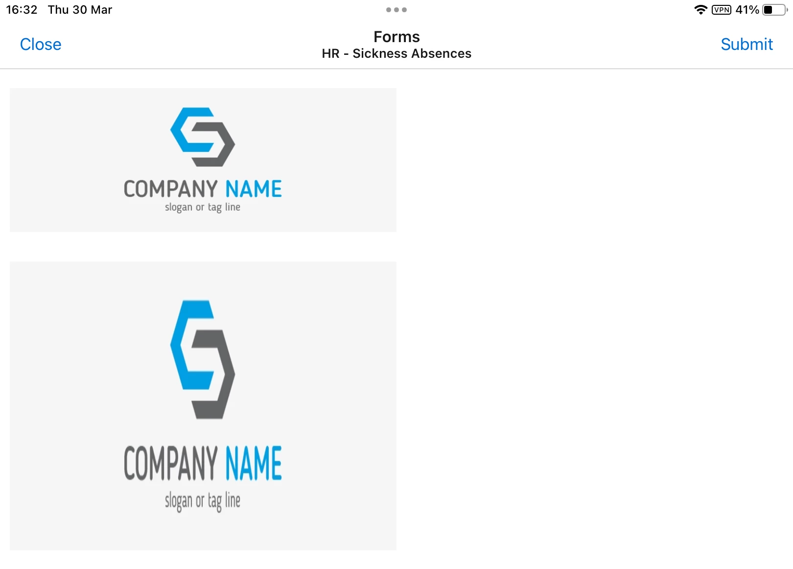
When I view the form on desktop browser both logos are centre across the form as intended. When I open the form via the Nintex Mobile app on iPad both are aligned left on the screen. The image is also skewed in the 2nd layout option on iPad.
I have a rich text control under the logo with a form title and I have this set to full width (4 columns) and have the text centred across the control. This does display correctly centred across the form on both desktop and iPad.
Is there a working method for getting images to correctly centre across the forms on all platforms? If so, I would be really grateful if someone could explain how to achieve this.
Or is there some limitation that means we are restricted to left aligned images only?
Please see some example images below (with our logo swapped out).
Form designer…


Form view in desktop browser…

Form view via Nintex Mobile on iPad…

Many thanks.

