I have a survey form to be re-created in Nintex, the original form has as questions with answers required on a scale of 1-10… How do I re-create this in Nintex?
Hi
Do you mind to specify the following
- Which Nintex SharePoint platform (2016, 2019, SP Online)
- Which Form Designer (Classic, Responsive, New Responsive)
Further consideration
- Who are you going to distribute the Nintex Survey form to? Internal User (within your SharePoint domain) or external users?
- How many questions do you have?
- How are you going to calculate or score the survey?
- Where are you going to save the results of the survey? To SharePoint?
Generic answer - I’m using the New Responsive Designer
You can use a Text Field or a Label field for the Question
I’m using 2019, currently using the Responsive design, however, i’ve only just started and wasn’t sure which designer would be best, so can revert if the classic would be better.
Distribution is to internal users.
On this form we have 6 questions, but I am aware of another form in the future with similar layout that has more questions.
Score will probably be calculated via workflow, end users don’t need to see the score. Results are being saved into SharePoint using workflow to update the list item.
Not sure what the ‘New Responsive Designer’ is, version of Nintex being used is v5.2.0.0. Is this part of a newer version that I haven’t got yet? We’re just working on some projects in the background before I can arrange for the upgrade.
I was hoping for something like this:
Hi
The New Responsive Designer is available on Nintex Automation Cloud (NAC)
or Nintex for Office365 (O365)
Responsive designer is able to do the following
The Radio button option which you desire may be impossible to do with Nintex.
Hi
Depending on the content and requirement of the project you have you might want to take a look into the survey app type available with the standard SharePoint, this app sadly is not supported by Nintex but does allow for the rating scale you mention supported fully.
However if more complex form design is needed then there are a few options for Nintex forms gathering 1-10, see below some of those.
For both classic and responsive forms you would want a choice control configured as follows:
It gives a pleasing look to the choice response buttons but I think we can make it better.
Using some CSS in the classic forms designer to make the buttons go full width, to do this just add the following class to the choice control as follows:
full-width-choice-button
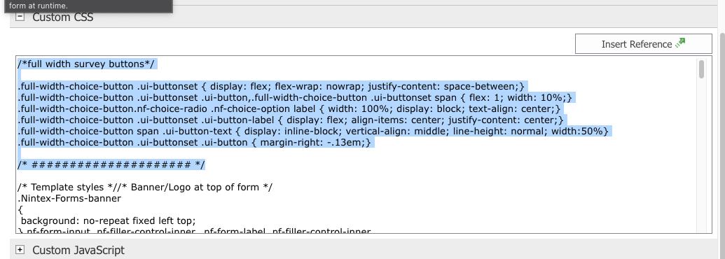
Then in Settings>Custom CSS add the following CSS code:
/*full width survey buttons*/
.full-width-choice-button .ui-buttonset { display: flex; flex-wrap: nowrap; justify-content: space-between;}
.full-width-choice-button .ui-buttonset .ui-button,.full-width-choice-button .ui-buttonset span { flex: 1; width: 10%;}
.full-width-choice-button.nf-choice-radio .nf-choice-option label { width: 100%; display: block; text-align: center;}
.full-width-choice-button .ui-buttonset .ui-button-label { display: flex; align-items: center; justify-content: center;}
.full-width-choice-button span .ui-button-text { display: inline-block; vertical-align: middle; line-height: normal; width:50%}
.full-width-choice-button .ui-buttonset .ui-button { margin-right: -.13em;}
/* ##################### */
Now you will have pretty full width response buttons, I added in the instructional text as labels to match.
Hi
Have you managed to solve your question?
Hi
Depending on the content and requirement of the project you have you might want to take a look into the survey app type available with the standard SharePoint, this app sadly is not supported by Nintex but does allow for the rating scale you mention supported fully.
However if more complex form design is needed then there are a few options for Nintex forms gathering 1-10, see below some of those.
For both classic and responsive forms you would want a choice control configured as follows:
It gives a pleasing look to the choice response buttons but I think we can make it better.
Using some CSS in the classic forms designer to make the buttons go full width, to do this just add the following class to the choice control as follows:
full-width-choice-button
Then in Settings>Custom CSS add the following CSS code:
/*full width survey buttons*/
.full-width-choice-button .ui-buttonset { display: flex; flex-wrap: nowrap; justify-content: space-between;}
.full-width-choice-button .ui-buttonset .ui-button,.full-width-choice-button .ui-buttonset span { flex: 1; width: 10%;}
.full-width-choice-button.nf-choice-radio .nf-choice-option label { width: 100%; display: block; text-align: center;}
.full-width-choice-button .ui-buttonset .ui-button-label { display: flex; align-items: center; justify-content: center;}
.full-width-choice-button span .ui-button-text { display: inline-block; vertical-align: middle; line-height: normal; width:50%}
.full-width-choice-button .ui-buttonset .ui-button { margin-right: -.13em;}
/* ##################### */
Now you will have pretty full width response buttons, I added in the instructional text as labels to match.
Thanks for that
@Jake , I’ll have a go at that and see how it turns out.
Reply
Enter your E-mail address. We'll send you an e-mail with instructions to reset your password.