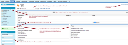
Comparing the “Accounts” page in the nonprofit starter pack with my SKUID version. First the standard version.  Then the SKUID version
  Click on each image to see my comments (in red.) Each page style has its strengths. The Salesforce version is more of a menu than a page. You can see a list of accounts… and also all the related actions you might take around accounts. And the “quick create” form is explicit, rather than implicit like SKUID’s “new” button. On the other hand, to actually enter or edit an account, you have to go to the account detail page and then come back. The SKUID version lets you actually work with accounts in the list. It has only the filters that its user’s need (assuming you added the filters you wanted). It’s interesting to me how different the “feel” and “style” of the two pages turns out to be. There are two whole different approaches to working with your data here… I can’ really articulate what the two approaches are. Maybe it will become clearer with the “Contact” form.
SKUID vs standard interface comparison.
 +9
+9This topic has been closed for replies.
Enter your E-mail address. We'll send you an e-mail with instructions to reset your password.


