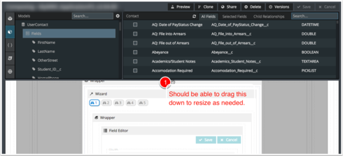
The new “collapse” feature for the “toolbox” in the page composer is a welcome addition. A couple of other ideas to improve the experience:
1) Allow the “toolbox” to be expanded by making the current separator control that supports collapse to be draggable to increase/decrease height of the toolbox. Often times the controls that I need are several sections deep and it takes a while to collapse everything and find what I’m looking for. Additionally, being able to see more fields or conditions, etc. on a model would ease in identifying what is there and what is not.
2) In the models tab, provide sections (similar to folders in components) for Master & Child models so that all the master models can easily be collapsed since they are not likely to be needed often.
Thanks!
Page Composer UI/UX Enhancement ideas
 +13
+13This topic has been closed for replies.
Enter your E-mail address. We'll send you an e-mail with instructions to reset your password.


