I’ve created a column chart that displays 8 different “series,” grouped into two groups. The data seems to behave properly, but the chart displays the columns with an odd spacing. The category is using the “owner name” which, doesn’t exist for one of the groups, thus the null label on the axis.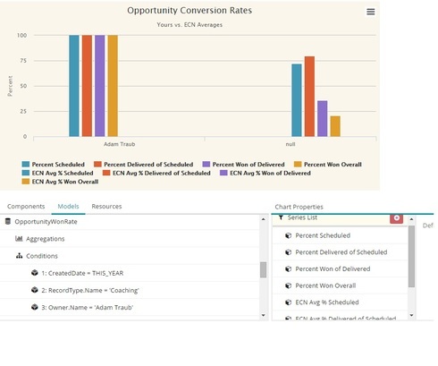
Is there an easy way to fix this spacing issue?

Question
Charts with Multiple Series = Weird spacing
 +4
+4

Enter your E-mail address. We'll send you an e-mail with instructions to reset your password.