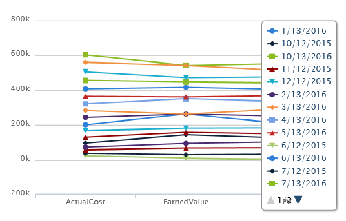

I'm in the process of implementing the High Chart control that is available in the K2 Market Place. The documentation is a bit limited, but I was able to figure out how the queries work. The issue I am coming across is how to format the results that are displayed. The desired result is to have the values of the Period Description column be the X axis, and the lines be the represented by Actual Cost, Earned Value, and PV.
Here is the ADO Query