Solved

Text controls not collapsing on 'hide control'

  • 10 July 2019
  • 5 replies
  • 17 views

Hi,

My K2 experience has always been with K2 5 and we recently upgraded to K2 latest version (3.5).


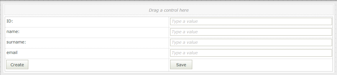
One of the benfits of K2 smartforms over SharePoint forms is the ability to show and hide columns on a form dependant on a condition or control choice (great experience for end users).


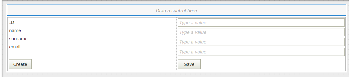
However, I keep noticing that if I hide a 'text' control then it will hide the control but not collpase the row so I end up with a 'massive blank space at the end of the form between the visible columns and the 'Save button and attachments section.


When hiding other controls such as a drop down, it does seem to behave as I would expect and fold up the form canvas for end users so that the save/attachements appear directly under the the last visible control ont he form.


Is this a bug? I am reluctant to put in a support ticket if this is a known issue but it's really ruining my form design and not sure if there is a fix to get around it?


Thanks Julie


icon

Best answer by JulieBird 15 July 2019, 14:44

View original

5 replies

Hello JulieBird,


This all depends on the design of your views/forms. When you generate a view based on your SmartObject, by default multiple rows will be created in which your controls will reside. This means that if you remove a control (e.g  hiding the textbox in your case), the row remains but without a control inside of it this time around hence an empty space appears when you load your view or form. Having said this, unfortunately there is not a rule that can remove the entire row along with the control. But you can perhaps, if you like, change a little bit of your design to make this happen.


Below is a little visual demonstration of what I mean.


I presume this your design:


In this design,there is multiple rows to accommodate each control. This means when I remove the "email" controls, the row remains empty hence there will be space between "surname" row and "create/save" row.   


Possible design workaround:


In this design, the controls reside in a single row and then designed such that they are aligned as desired. In this manner, when I remove (hide) my "email" controls, the space that they occupy goes along with the controls because the row will adjust to fit the remaining controls. 


So to answer your question...No, this is not a bug but rather about the design of your solution.


I hope you understand the point and you find it helpful. Should that be the case, please could you mark this response as such by "Mark As Solution" or "Kudo" because it will be helpful to other members of the community who have similar issues and/or questions.


Regards,


Katleho


Many thanks for your quick response reply Katlehon, and yes your answer does make sense to me so well explained!


I kinda get where you are coming from, but I have noticed that when using the hide rule on other types of controls (such as a dropdown control), it does collapse the row aswell as the column.  Although to be fair I haven't had time to prove this yet and do a screengrab video on here to prove it lol.


Thanks for your workaround solution but before I accept this as a solution I am intrigued as in how you have managed to get your label data fields to sit underneath each other that emulates a line break?  Because in the K2 5 version I have (3.5 I think) I cannot do this, the labels will only position themselves 'after one another' in a single row, I can not force them to sit underneath each other to emulate a line break


Hope that makes sense? .. are you using K2 5 or the K4 client version?


Julie :-)


Hi JulieBird,


You mean 5.3 not 3.5? I am using K2 5.3. But it works them same on all the versions I think.


To make your label data fields to sit underneath each other you have to set the width of each one of them to 100%.


See image below:


And then you might need to adjust the length of the data label space to match their textboxes. You can make use of "Styles" properties to achieve this.


See image below for example:  


I hope this helps you.


Regards,


Katleho

Thanks Katelon,


Putting all labels and controls inside a row at 100% didnt work for me because a lot of the label text is large (questions rather than label headings) and so we need it to wrap, which put it out of alignment with the input controls.


However, using the same principle I put a layout table inside a single row and used the show/hide rule on the table instead of the controls and it worked well :-)


I don't think it would have done in previous versions because it was really hard to line up table columns exactly but since they have introduced the width property on table cells it looks great!


Reply