Note: Nintex Workflow Cloud (NWC) is now called Nintex Automation Cloud (NAC)
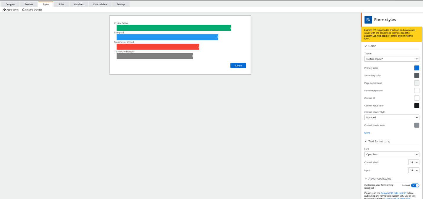
With the latest release of NAC, we now can modify and add custom CSS to any NAC form. Which not only enables granular control with the look and feel, but now you also have the ability to display information in a more graphical way…..like using workflow data in a bar or pie chart.
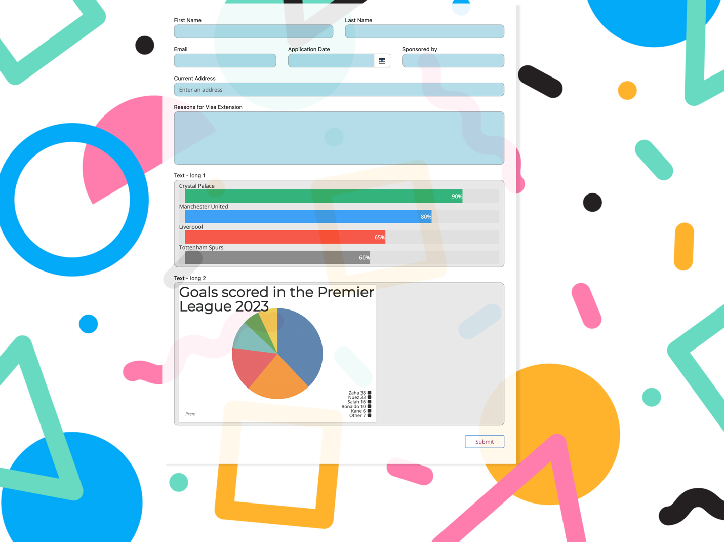
In the above screenshot, I have added custom CSS to each of the inputs, a background image (a great way to make your forms pop) and I’ve converted some html in a label to a CSS based chart.
Lets look at how I put together the bar chart.
- First thing we need to do, is drag and drop a label control on the form and add some HTML to a label (using the HTML option). Example below:
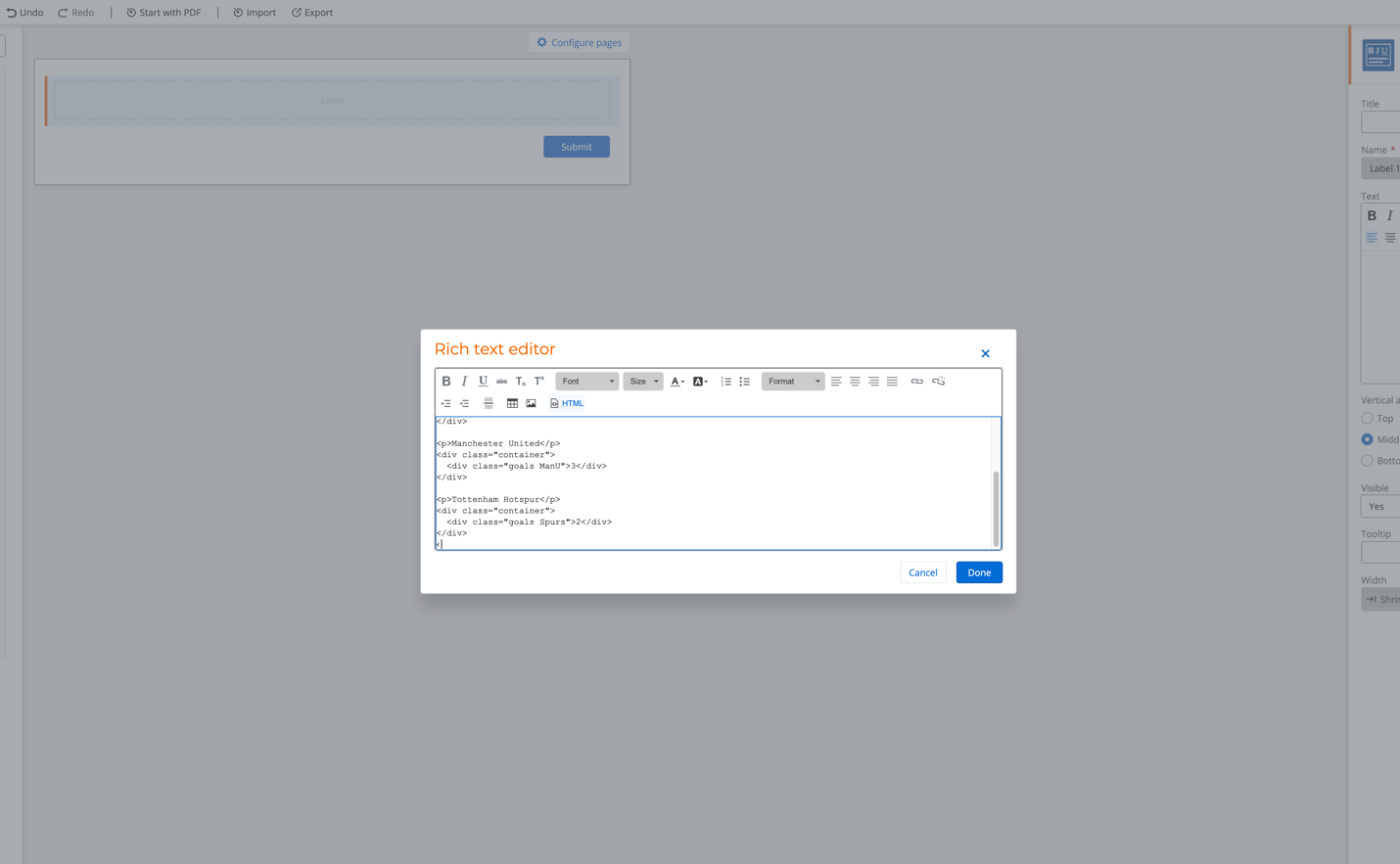
Use the following HTML to follow the example:
<p>Crystal Palace</p>
<div class="container">
<div class="goals palace">9</div>
</div>
<p>Liverpool</p>
<div class="container">
<div class="goals liverpool">7</div>
</div>
<p>Manchester United</p>
<div class="container">
<div class="goals ManU">3</div>
</div>
<p>Tottenham Hotspur</p>
<div class="container">
<div class="goals Spurs">2</div>
</div>
Remember we can create a rule to pass in data values from the workflow into the HTML, so you can display dynamic data from the workflow.
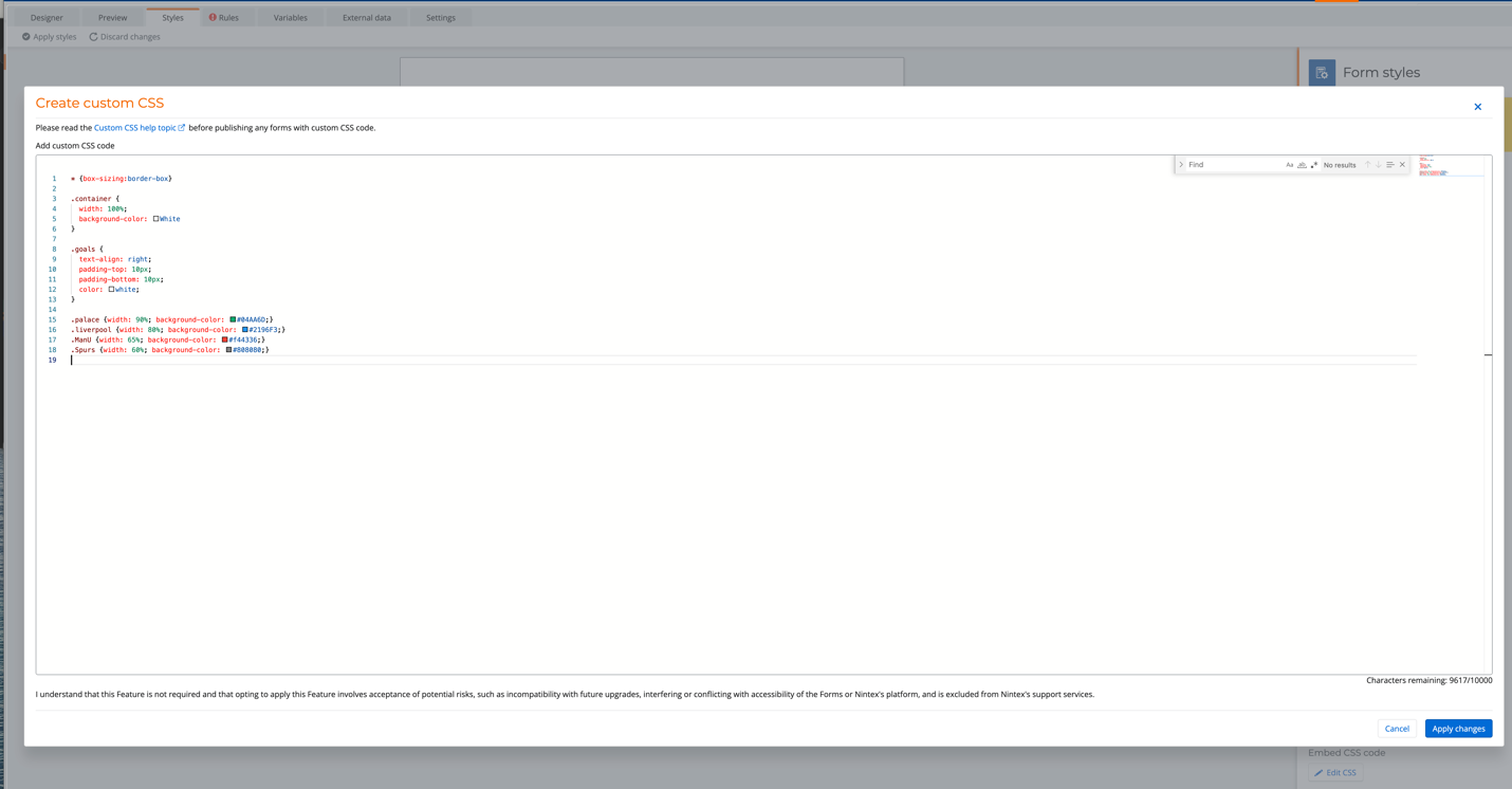
- Now we need to add some CSS to the CSS editor, to style and generate a bar chart from the HTML in the label
By going to advanced styles under styles, enable CSS then open up the Embedded CSS editor.
Add the following CSS to follow the example and click save changes.
* {box-sizing:border-box}
.container {
width: 100%;
background-color: White
}
.goals {
text-align: right;
padding-top: 10px;
padding-bottom: 10px;
color: white;
}
.palace {width: 90%; background-color: #04AA6D;}
.liverpool {width: 80%; background-color: #2196F3;}
.ManU {width: 65%; background-color: #f44336;}
.Spurs {width: 60%; background-color: #808080;}
And that’s it, The CSS will be instantly applied and will style up the HTML in the label control as a bar chart. This is a simple straightforward example where you can easily extend or take inspiration with doing something else like a pie chart.