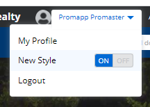
We're updating the look and feel of Promapp to align with the overall Nintex platform. We'll be making a few functionality changes and refreshing our fonts, colours, and icons to make them more accessible. You will be able to switch back to the classic theme until June, after which the new theme will become permanent. This option is available at an individual user level. For existing minimode links the new theme will be displayed.
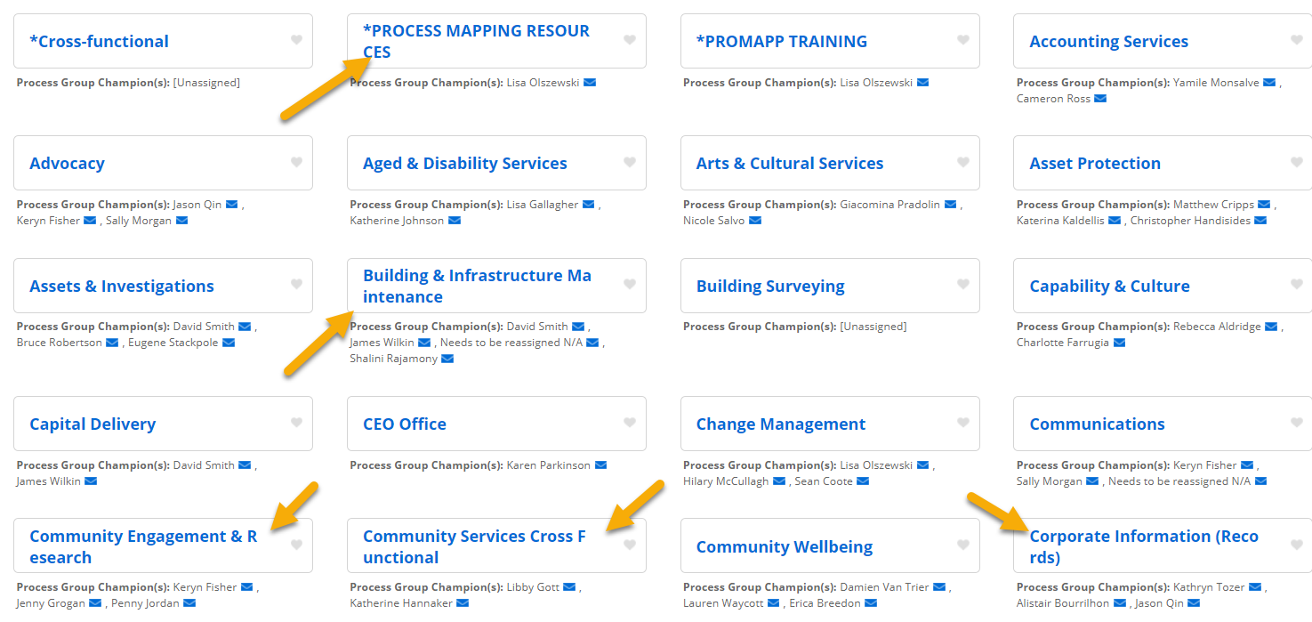
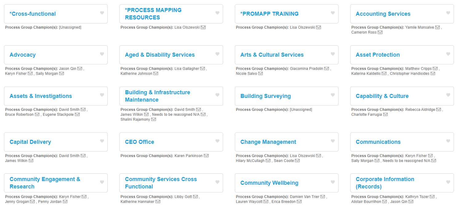
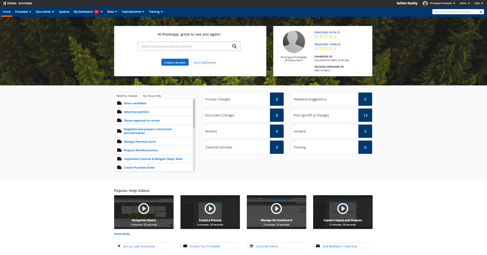
New homepage
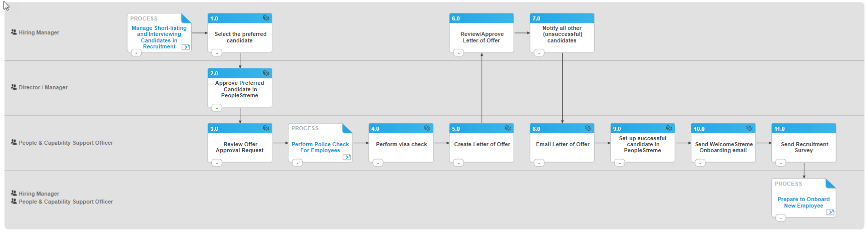
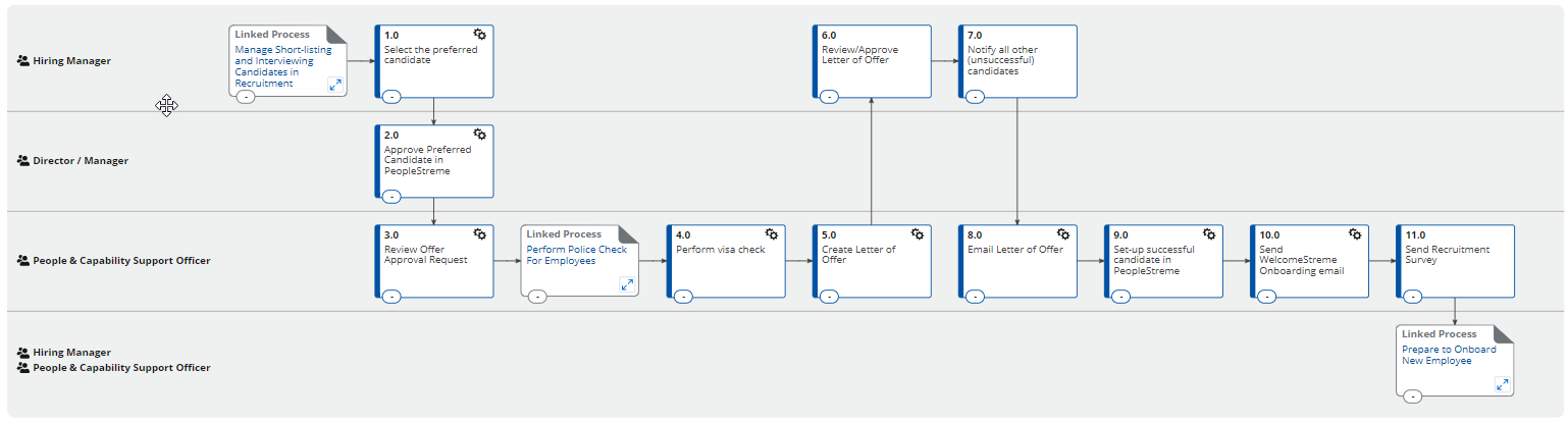
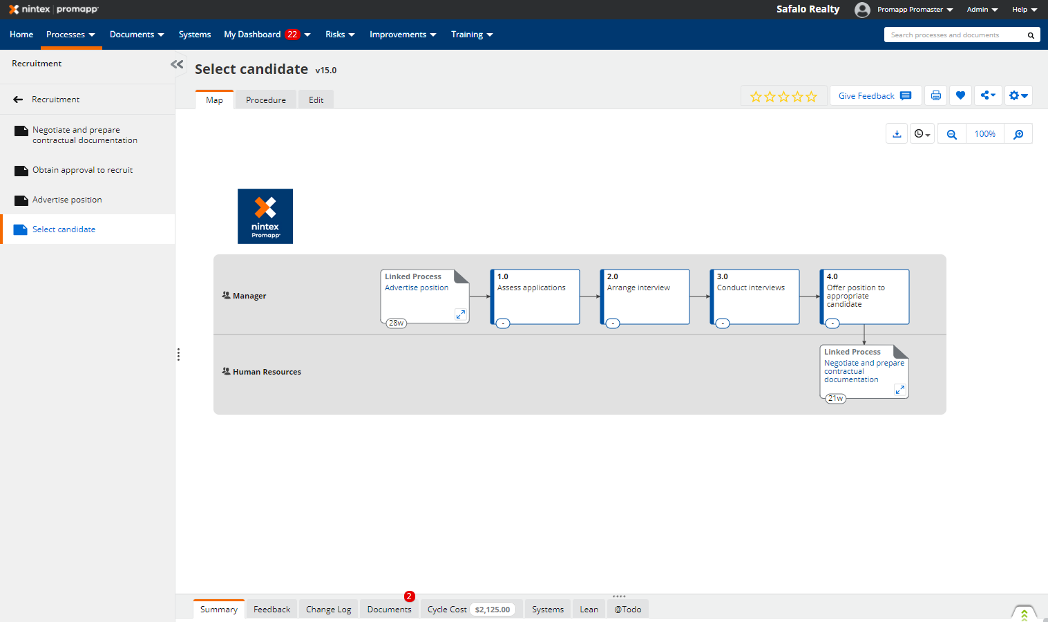
New Process Map
Functionality changes
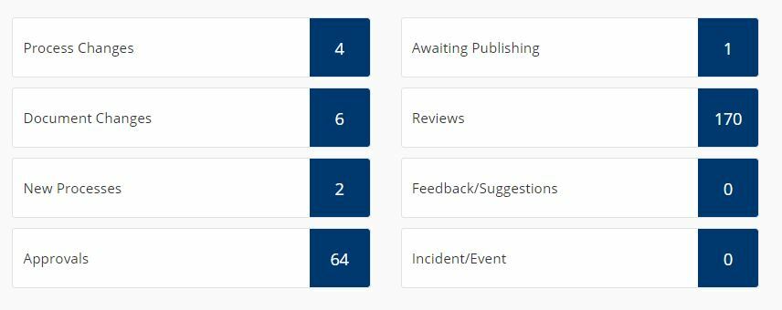
We'll be removing several components on the homepage:
- The 'Love it / It's OK / Not great' feedback functionality will be removed.
- Users can provide feature requests and ideas via a link to UserVoice.
- Methodology questions, solutions, and knowledge can be shared via Nintex Community
- Users will receive an occasional prompt for feedback via an NPS question, with the option to provide additional feedback afterwards.
- The Awesomeness meter will be removed.
- The Bulletin board and messages will be removed.
- Profile information and the Governance Dashboard will be removed as these are duplicate components available elsewhere on the site.
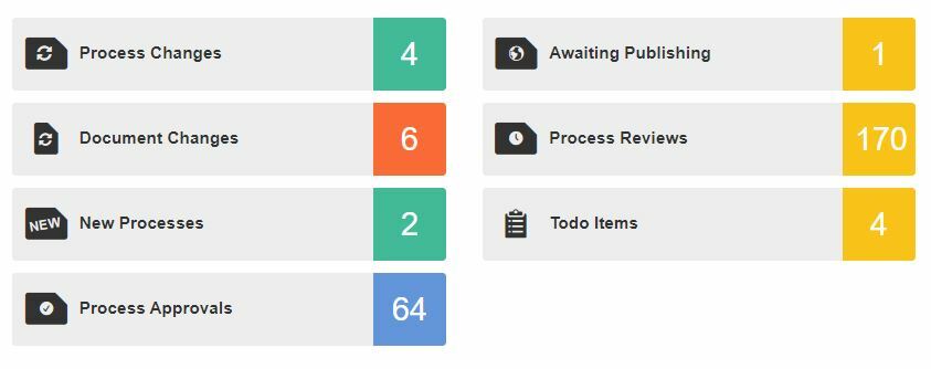
Process Map
- Customisable map colours will no longer be available.
To learn more about why we're making these changes and understand our overall unification strategy, you can read this blog from our VP of Product and Experience, Zoe Clelland.