Did you know that Drawloop DocGen can store all of your legal and non-legal content in it’s app and push the content into your templates at runtime with hide-display rules applied? This could generate a single line or several pages of text completely bulleted and indented to your specifications. The capability has been available for while now, but few customers know about it. This capability provides Drawloop users the ability to centralize content (clauses) so that they can be managed within the Drawloop app instead of templates themselves. Why would anyone do this? So admins don’t need to manage several template files that contain the same clause whenever the clause itself changes. Instead, a change can be made to a single clause in the Drawloop app and then it instantaneously becomes live across all templates that leverage the clause. Did I mention you can apply filters to each clause?
Often, Drawloop users will create many file versions of one use case. And multiple templates for one solution can be necessary when there are scenarios where different versions of a solution are required. That’s when certain data must dictate which version of an output you will need. Be it a record type, state, language, regional office, SKU, or any other data point in SFDC, there may be a need to change the language of an output given the circumstances. Drawloop created the component library to handle such a use case where you can still have the outcome of several versions, but just 1 template to manage.
If you navigate to the bottom of any DocGen Package, you will see where you can begin creating components and their groupings. And if you don’t know what a DocGen package is, please refer to this page:
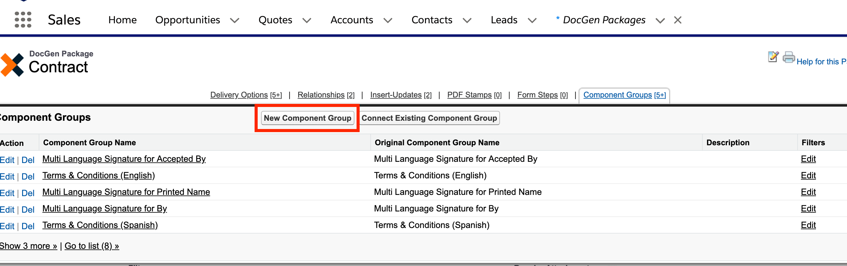
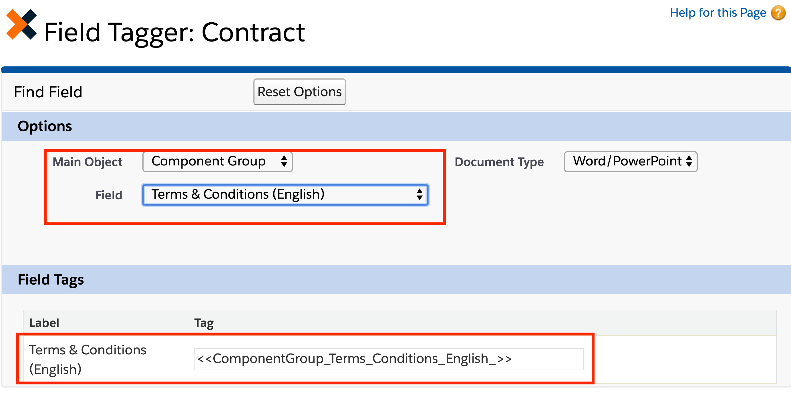
Now what is a component group? A component group is simply a container for one or more components. It’s where you decide what components are going to be included for your use case and when the use case is included. In the image above, you can see there are several component groups for Terms & Conditions, but some groups supports a different language for the same content.
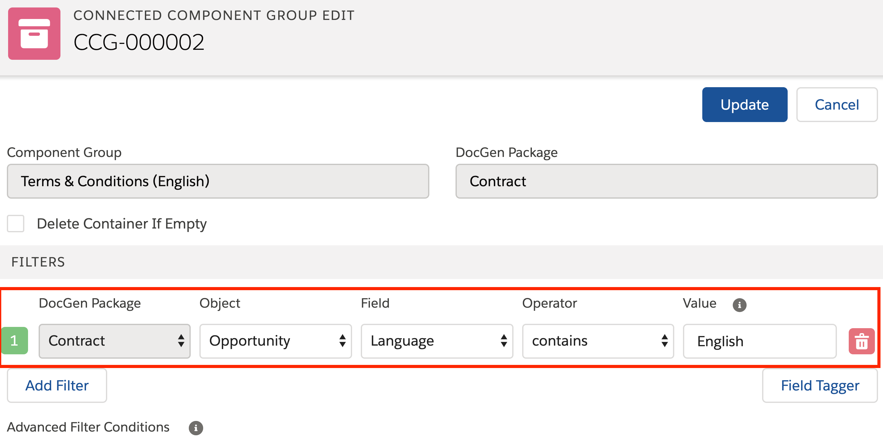
So the groups contain components with identical content, but in different languages that support English, Spanish, German etc. When the ‘New Component Group’ button is selected, you will be taken right into the designer.
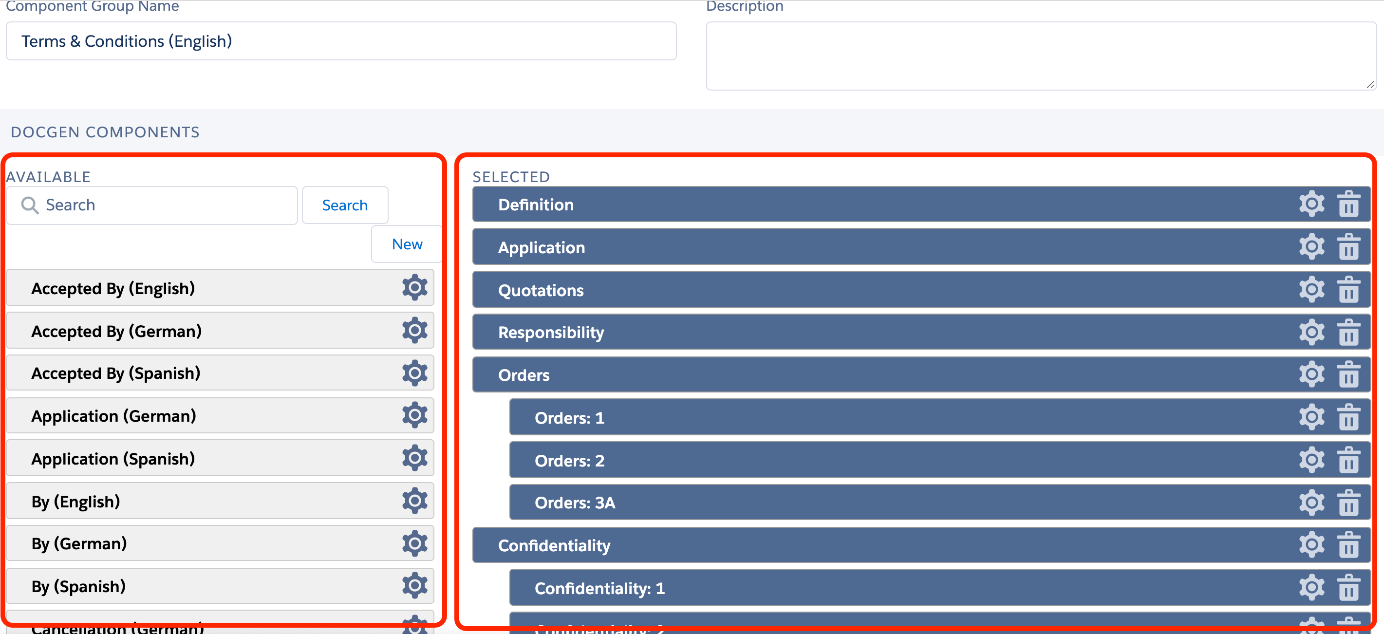
What you see above is the component group designer. This is where you can customize your group, create new components and add in existing components. Your existing components are on the left. Selected components are on the right. The order and indentation of your components are a drag-and-drop process. If there’s an indentation in your components, they will be indented on the output and numbered according to the format of your template. To create a new component, you can select the ‘New’ button where you see the list of existing components.
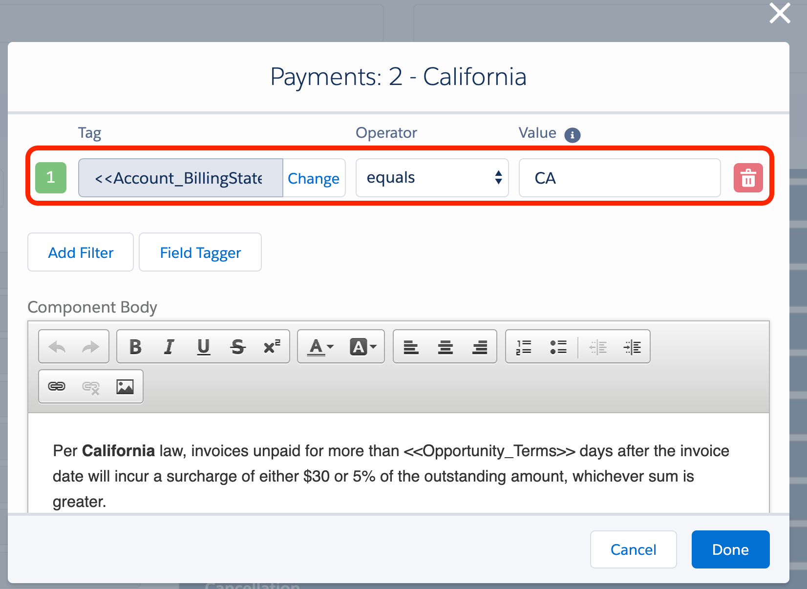
What you see above is an example of a component. A component can contain text or an image. The text can be static, dynamic or both. So using the <<Tags>> that are typically used in a template are compatible with components. You can also add up to 5 filters in each component along with complex scenario handling ex: if rule 1 OR (2 and 3) apply.
Once your component group is configured, you can access a tag to the group and put it in your template. The result(s) of the group are then pushed into your templates at runtime; filtered and all.
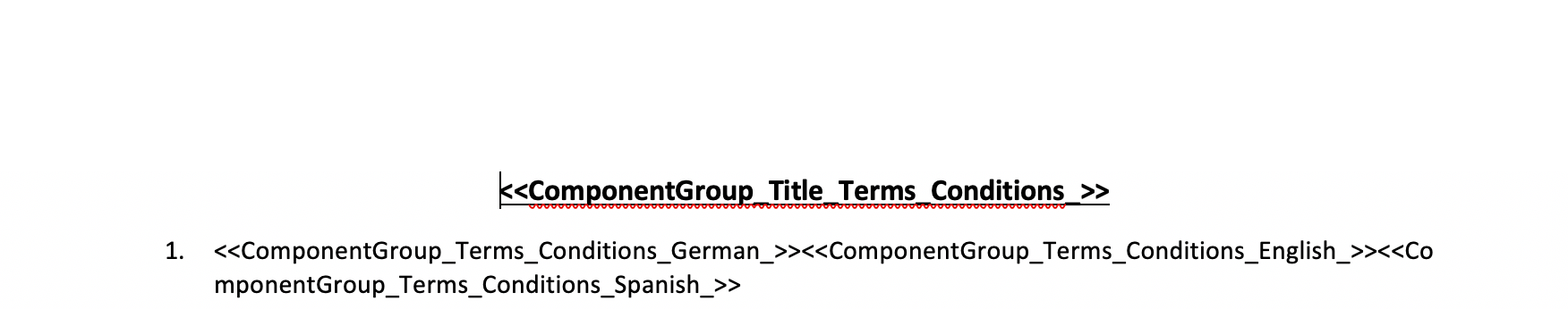
If there are no results in your group, it will just result in a blank value. So you can stake your tags in the case of multi-language support like you see in the Drawloop template above.
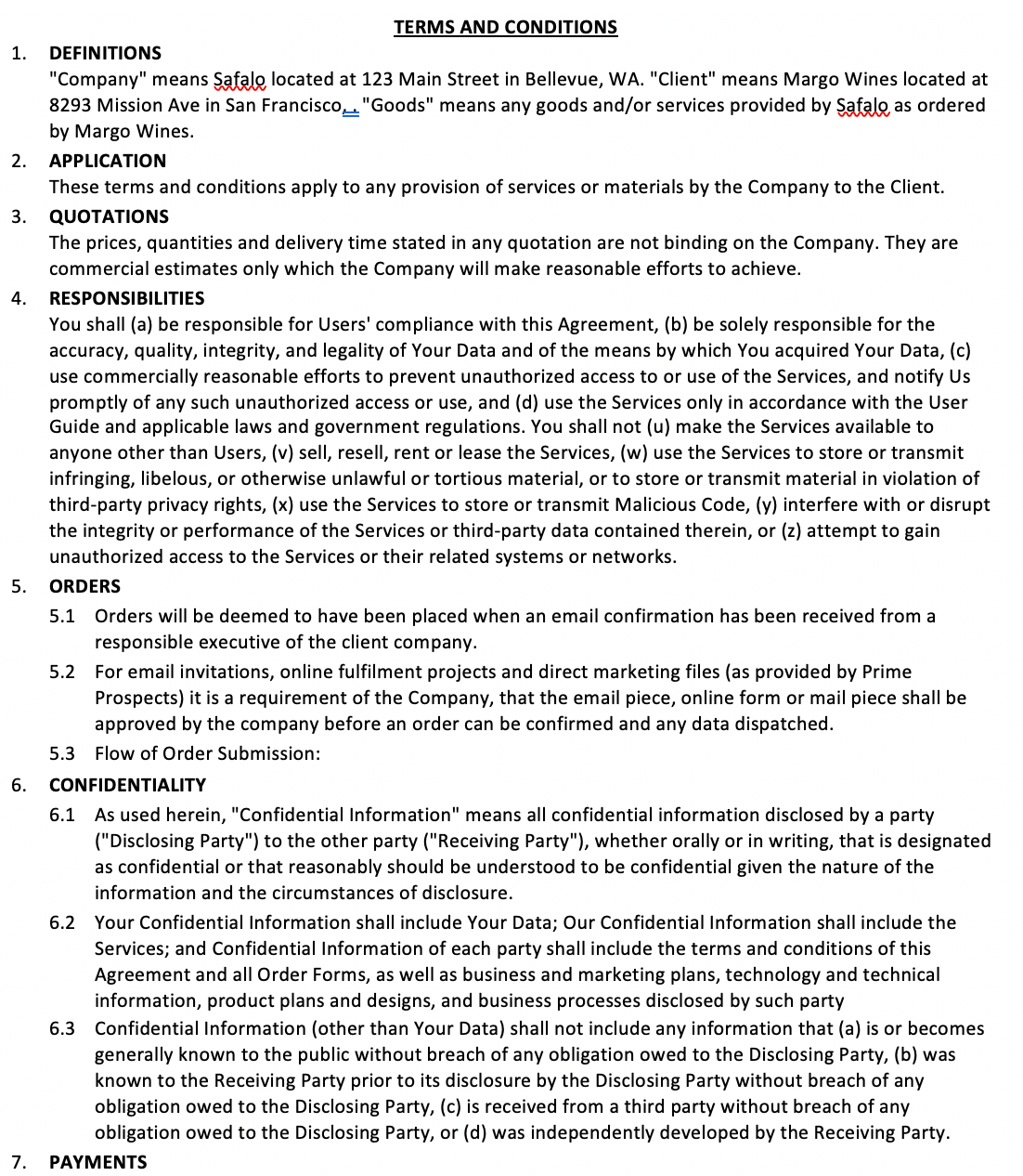
And the result will be a fully tailored version of your use case. Like you see in the above English version of the output.
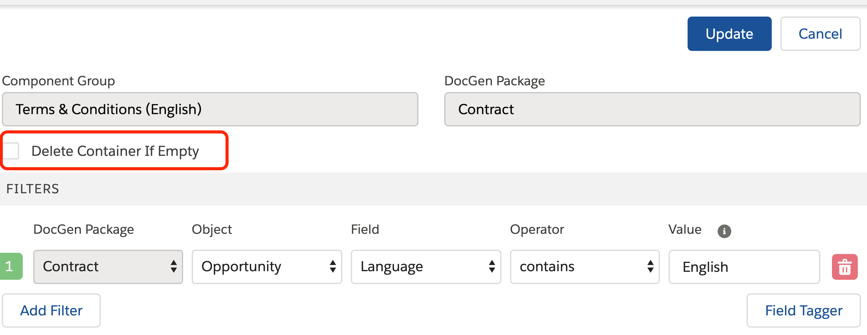
One last thing before I let you go! Each component group provides the option to delete a line of space if there are no results output by your component group. This is handy when you tag a template with a component group, but want the dead or empty white space to disappear if there aren’t any values to show.